
Download all figures as PDFs in one ZIP archive; individual figures are found below; for multi-panel figures, single panels are also available.
Manuscript page
Figures
Fig. 1

FIG. 1: Food prices and model simulations - The FAO Food Price Index (blue solid line) [1], the ethanol supply and demand model (blue dashed line), where dominant supply shocks are due to the conversion of corn to ethanol so that price changes are proportional to ethanol production (see Appendix C) and the results of the speculator and ethanol model (red dotted line), that adds speculator trend following and switching between investment markets, including commodities, equities and bonds (see Appendices D and E).
Fig. 2
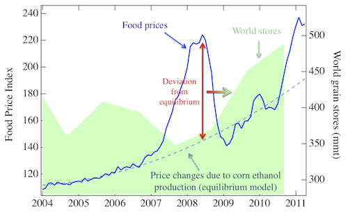
FIG. 2: Impact of food prices on grain inventories - A deviation of actual prices (solid blue curve) from equilibrium (dashed blue curve) indicated by the red arrow leads to an increase in grain inventories (green shaded area) delayed by approximately a year (red to green arrow). This prediction of the theory is consistent with observed data for 2008/2009. Increasing inventories are counter to supply and demand explanations of the reasons for increasing food prices in 2010. Restoring equilibrium would enable vulnerable populations to afford the accumulating grain inventories.
Fig. 3
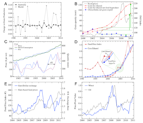
FIG. 3: Analysis of possible causes of food price increases - A: Weather, specifically droughts in Australia. Comparison of change in world (grey) and Australian (black) grain production relative to total world production by weight [87]. The correlation is small. B: Emerging markets, specifically meat consumption in China. Comparison of China and India net grain export (dashed blue) to the US corn ethanol conversion demand (solid red) and net demand after feed byproduct (dotted red) [98], and FAO food price index (solid black). Arrows show the maximum dirence from their respective values in 2004. The impact of changes in China and India is much smaller. C : Supply and demand. Corn price (dashed purple) and global consumption (solid green) along with best fits of supply and demand model (dotted blue) (see Appendix B) [87]. Price is not well described after 2000. D: Ethanol production (Fig. 6). US corn used for ethanol production (blue circles) and FAO Food Price Index (red triangles). Values are normalized to range from 0 to 1 (minimum to maximum) during this period. Dotted lines are best fits for quadratic growth, with coefficientscients of 0.0083 ± 0.0003 and 0.0081 ± 0.0003 respectively. The 2007/8 bubble was not included in the fit of prices [87]. E: Currency conversion: Euro-based FAO Food Price Index (dashed black), Euro/Dollar exchange (solid blue) [99]. Both have peaks at the same times as the food prices in dollars. However, food price increases in dollars should result from decreasing exchanges rates. F : Oil prices. Wheat price (solid blue) and Brent crude oil price (dashed black). The peak in oil prices follows the peak in wheat prices and so does not cause it [100].
Fig. 3A

Fig. 3A: Analysis of possible causes of food price increases: Weather, specifically droughts in Australia. Comparison of change in world (grey) and Australian (black) grain production relative to total world production by weight [87]. The correlation is small.
Fig. 3B

Fig. 3B: Analysis of possible causes of food price increases: Emerging markets, specifically meat consumption in China. Comparison of China and India net grain export (dashed blue) to the US corn ethanol conversion demand (solid red) and net demand after feed byproduct (dotted red) [98], and FAO food price index (solid black). Arrows show the maximum difference from their respective values in 2004. The impact of changes in China and India is much smaller.
Fig. 3C
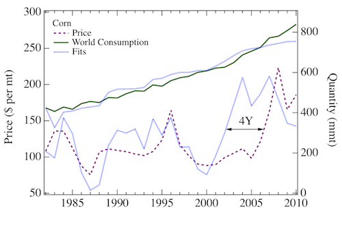
Fig. 3C: Analysis of possible causes of food price increases: Supply and demand. Corn price (dashed purple) and global consumption (solid green) along with best fits of supply and demand model (dotted blue) (see Appendix B) [87]. Price is not well described after 2000.
Fig. 3D

Fig. 3D: Analysis of possible causes of food price increases: Ethanol production (Fig. 6). US corn used for ethanol production (blue circles) and FAO Food Price Index (red triangles). Values are normalized to range from 0 to 1 (minimum to maximum) during this period. Dotted lines are best fits for quadratic growth, with coefficients of 0.0083 ± 0.0003 and 0.0081 ± 0.0003 respectively. The 2007/8 bubble was not included in the fit of prices [87].
Fig. 3E

Fig. 3E: Analysis of possible causes of food price increases: Currency conversion: Euro-based FAO Food Price Index (dashed black), Euro/Dollar exchange (solid blue) [99]. Both have peaks at the same times as the food prices in dollars. However, food price increases in dollars should result from decreasing exchanges rates.
Fig. 3F

Fig. 3F: Analysis of possible causes of food price increases: Oil prices. Wheat price (solid blue) and Brent crude oil price (dashed black). The peak in oil prices follows the peak in wheat prices and so does not cause it [100].
Fig. 4

FIG. 4: Time dependence of dirent investment markets - Markets that experienced rapid declines, "the bursting of a bubble", between 2004 and 2011. Houses (yellow) [142], stocks (green) [143], agricultural products (wheat in blue, corn in orange) [87], metals (grey) [100], food (red) [1], oil (black) [100]. Vertical bands correspond to periods of food riots and major social protests called the "Arab Spring" [94]. Values are normalized from 0 to 1, minimum and maximum values respectively, during the period up to 2010.
Fig. 5

FIG. 5: Supply and demand model - For wheat, corn, rice, sugar (left to right and top to bottom). Price time series of the commodity (dashed purple lines) and global consumption time series (solid green lines). Blue dotted curves are best fits according to Eq. 7 and Eq. 8 for prices and consumption, respectively. Annual supply-demand values are from [87], and prices from [100].
Fig. 5 top left
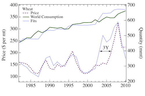
FIG. 5 top left: Supply and demand model for wheat; price time series of the commodity (dashed purple lines) and global consumption time series (solid green lines). Blue dotted curves are best fits according to Eq. 7 and Eq. 8 for prices and consumption, respectively. Annual supply-demand values are from [87], and prices from [100].
Fig. 5 top right

FIG. 5 top right: Supply and demand model for corn; price time series of the commodity (dashed purple lines) and global consumption time series (solid green lines). Blue dotted curves are best fits according to Eq. 7 and Eq. 8 for prices and consumption, respectively. Annual supply-demand values are from [87], and prices from [100].
Fig. 5 bottom left
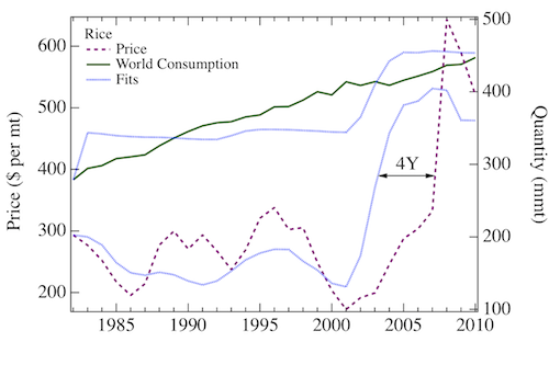
FIG. 5 bottom left: Supply and demand model for rice; price time series of the commodity (dashed purple lines) and global consumption time series (solid green lines). Blue dotted curves are best fits according to Eq. 7 and Eq. 8 for prices and consumption, respectively. Annual supply-demand values are from [87], and prices from [100].
Fig. 5 bottom right

FIG. 5 bottom right: Supply and demand model for sugar; price time series of the commodity (dashed purple lines) and global consumption time series (solid green lines). Blue dotted curves are best fits according to Eq. 7 and Eq. 8 for prices and consumption, respectively. Annual supply-demand values are from [87], and prices from [100].
Fig. 6

FIG. 6: Model results - Annual corn used for ethanol production in the US (blue circles) and the FAO Food Price Index from 1991-2010 (red triangles). Values are normalized to range from 0 (minimum) to 1 (maximum) during this period. Dotted lines are best fits to quadratic growth, with quadratic coefficientscients of 0.0083 ± 0.0003 for corn ethanol and 0.0081 ± 0.0003 for FAO index. Goodness of fit is measured with the coefficientscient of determination, R2 = 0.989 for corn and R2 = 0.986 for food. The 2007-2008 peak was not included in the fit of the FAO index time series.
Fig. 7
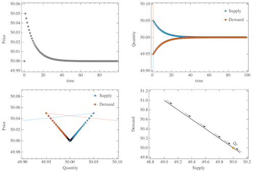
FIG. 7: Dynamics without speculators - Dynamic response of the system to a supply/demand shock at time t = 0. Top Left : Exponential convergence of P to its equilibrium value. Top Right : Supply and Demand as a function of time. Bottom Left : Price/Quantity relationship. Bottom Right : Dynamic evolution of Qd vs Qs. Value of parameters: ksd = 0.1, kc = 5.
Fig. 7 top left
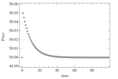
FIG. 7 top left: Dynamics without speculators - Dynamic response of the system to a supply/demand shock at time t = 0. Exponential convergence of P to its equilibrium value.
Fig. 7 top right
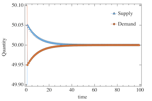
FIG. 7 top right: Dynamics without speculators - Dynamic response of the system to a supply/demand shock at time t = 0. Supply and demand as a function of time.
Fig. 7 bottom left

FIG. 7 bottom left: Dynamics without speculators - Dynamic response of the system to a supply/demand shock at time t = 0. Price/quantity relationship.
Fig. 7 bottom right

FIG. 7 bottom right: Dynamics without speculators - Dynamic response of the system to a supply/demand shock at time t = 0. Dynamic evolution of Qd vs Qs. Value of parameters: ksd = 0.1, kc = 5.
Fig. 8

FIG. 8: Dynamics with speculators: ksp < 1 - Dynamic response of the system to a supply/demand shock at time t = 0. Top Left : Oscillating convergence of P to its equilibrium value. Top Right : Supply and Demand as a function of time. Bottom Left : Price/quantity relationship. Bottom Right : Dynamic evolution of Qd vs Qs towards Qe.
Fig. 8 top left

FIG. 8 top left: Dynamics with speculators: ksp < 1 - Dynamic response of the system to a supply/demand shock at time t = 0. Oscillating convergence of P to its equilibrium value.
Fig. 8 top right

FIG. 8 top right: Dynamics with speculators: ksp < 1 - Dynamic response of the system to a supply/demand shock at time t = 0. Supply and demand as a function of time.
Fig. 8 bottom left

FIG. 8 bottom left: Dynamics with speculators: ksp < 1 - Dynamic response of the system to a supply/demand shock at time t = 0. Price/quantity relationship.
Fig. 8 bottom right

FIG. 8 bottom right: Dynamics with speculators: ksp < 1 - Dynamic response of the system to a supply/demand shock at time t = 0. Dynamic evolution of Qd vs Qs towards Qe.
Fig. 9

FIG. 9: Dynamics with speculators: ksp = 1 - Dynamic response of the system to a supply/demand shock at time t = 0. Top Left : Oscillations of P around its equilibrium value. Top Right : Supply and demand as a function of time. Bottom Left : Price/quantity relationship. Bottom Right : Dynamic evolution of Qd vs Qs.
Fig. 9 top left

FIG. 9 top left: Dynamics with speculators: ksp = 1 - Dynamic response of the system to a supply/demand shock at time t = 0. Oscillations of P around its equilibrium value.
Fig. 9 top right

FIG. 9 top right: Dynamics with speculators: ksp = 1 - Dynamic response of the system to a supply/demand shock at time t = 0. Supply and demand as a function of time.
Fig. 9 bottom left

FIG. 9 bottom left: Dynamics with speculators: ksp = 1 - Dynamic response of the system to a supply/demand shock at time t = 0. Price/quantity relationship.
Fig. 9 bottom right

FIG. 9 bottom right: Dynamics with speculators: ksp = 1 - Dynamic response of the system to a supply/demand shock at time t = 0. Dynamic evolution of Qd vs Qs.
Fig. 10

FIG. 10: Dynamics with speculators: ksp > 1 - Dynamic response of the system to a supply/demand shock at time t = 0. Top Left : Oscillating divergence of P to its equilibrium value. Top Right : Supply and demand as a function of time. Bottom Left : Price/quantity relationship. Bottom Right : Dynamic evolution of Qd vs Qs away from Qe.
Fig. 10 top left

FIG. 10 top left: Dynamics with speculators: ksp > 1 - Dynamic response of the system to a supply/demand shock at time t = 0. Oscillating divergence of P to its equilibrium value.
Fig. 10 top right

FIG. 10 top right: Dynamics with speculators: ksp > 1 - Dynamic response of the system to a supply/demand shock at time t = 0. Supply and demand as a function of time. Fig.
10 bottom left
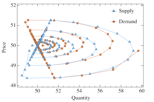
FIG. 10 bottom left: Dynamics with speculators: ksp > 1 - Dynamic response of the system to a supply/demand shock at time t = 0. Price/quantity relationship.
Fig. 10 bottom right

FIG. 10 bottom right: Dynamics with speculators: ksp > 1 - Dynamic response of the system to a supply/demand shock at time t = 0. Dynamic evolution of Qd vs Qs away from Qe.
Fig. 11
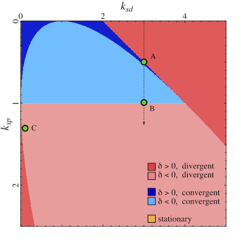
FIG. 11: Model Phase Diagram - Behavior of the model for dirent values of its two main parameters, ksd and ksp. Dark red regions correspond to a divergent behavior according to Eq. 22, light red to a divergent behavior according to Eq. 24 (see also Fig. 10), light blue to a convergent behavior (Eq. 24 and Fig. 8), as well as dark blue (Eq. 22). A thin yellow line between the light blue and light red regions delines a stationary point at ksp = 1 (Eq. 24 and Fig. 9). The region from point A to point B represents the stabilizing ect of speculators as ksp increases at ksd = 3. C is the point in the phase space (ksd; ksp) corresponding to the values obtained with the fitting of food price data (see Fig. 12).
Fig. 12

FIG. 12: Model Results - Top: Solid line is the monthly FAO Food Price Index between Jan 2004 and Apr 2011. Dashed line is the best fit according to Eq. 28. The effect of speculators is turned on in the first half of 2007, when the housing bubble collapsed. Bottom: Time series used as input to the speculator model, S&P500 index (stock market, in blue) and inverse of the US 10-year Treasury Note Yield (bonds, in black).
Fig. 12 top

FIG. 12 top: Model results: Solid line is the monthly FAO Food Price Index between Jan 2004 and Apr 2011. Dashed line is the best fit according to Eq. 28. The effect of speculators is turned on in the first half of 2007, when the housing bubble collapsed.
Fig. 12 bottom

FIG. 12 bottom: Model results: Time series used as input to the speculator model, S&P500 index (stock market, in blue) and inverse of the US 10-year Treasury Note Yield (bonds, in black).